Davidson
A corporate rebranding for an atypically adventurous accounting firm.
Client | DAVIDSON & COMPANY
Davidson and Company has a lengthy, storied and successful history providing highly responsive accounting services in Vancouver. Recently, Davidson has undergone a period of transition, growth and evolution needing to be reflected in their corporate brand. MIU was brought on as their strategic and design partner to collaboratively tackle a comprehensive rebrand.
Services
- Brand Strategy
- Naming
- Tagline
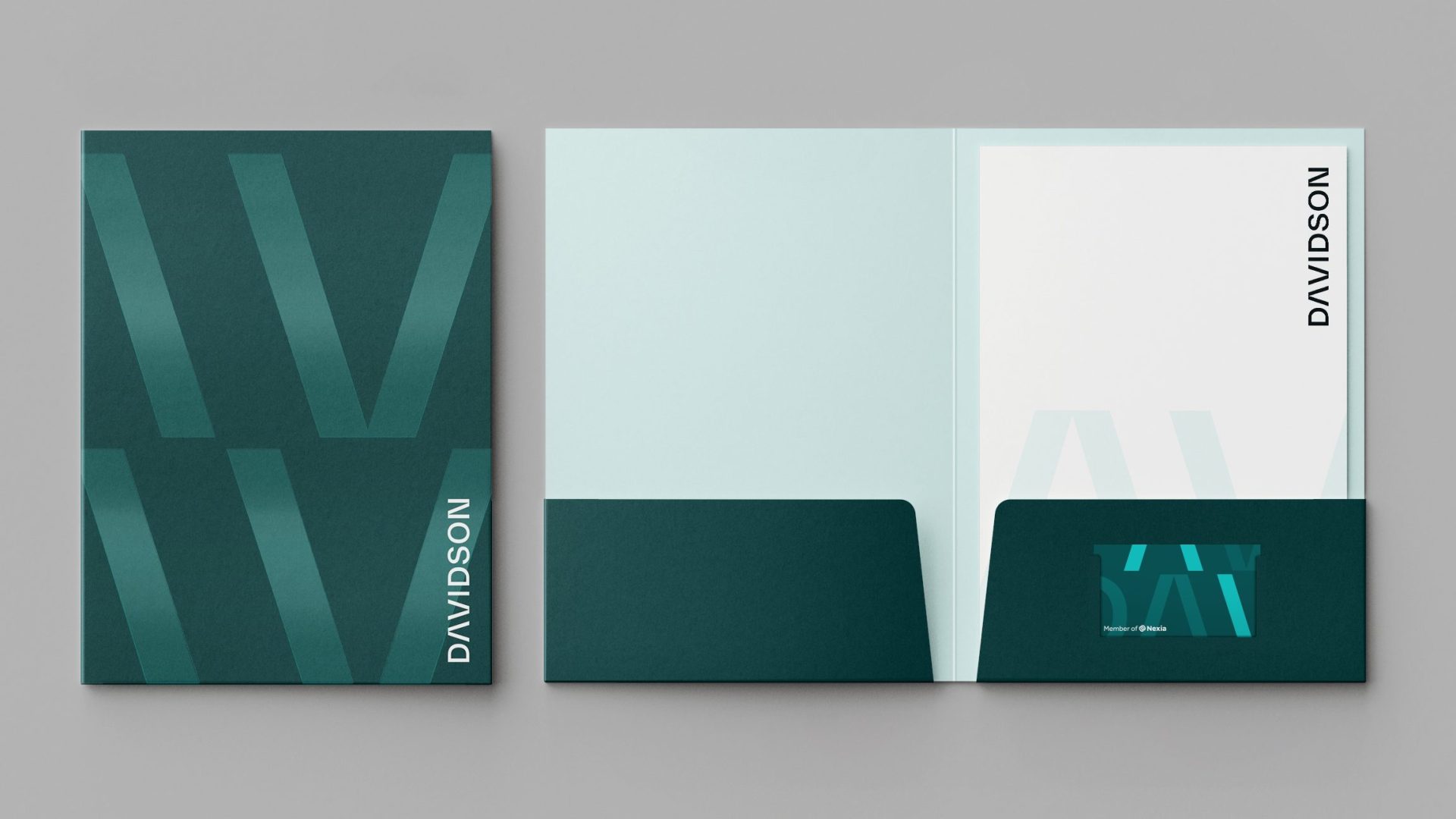
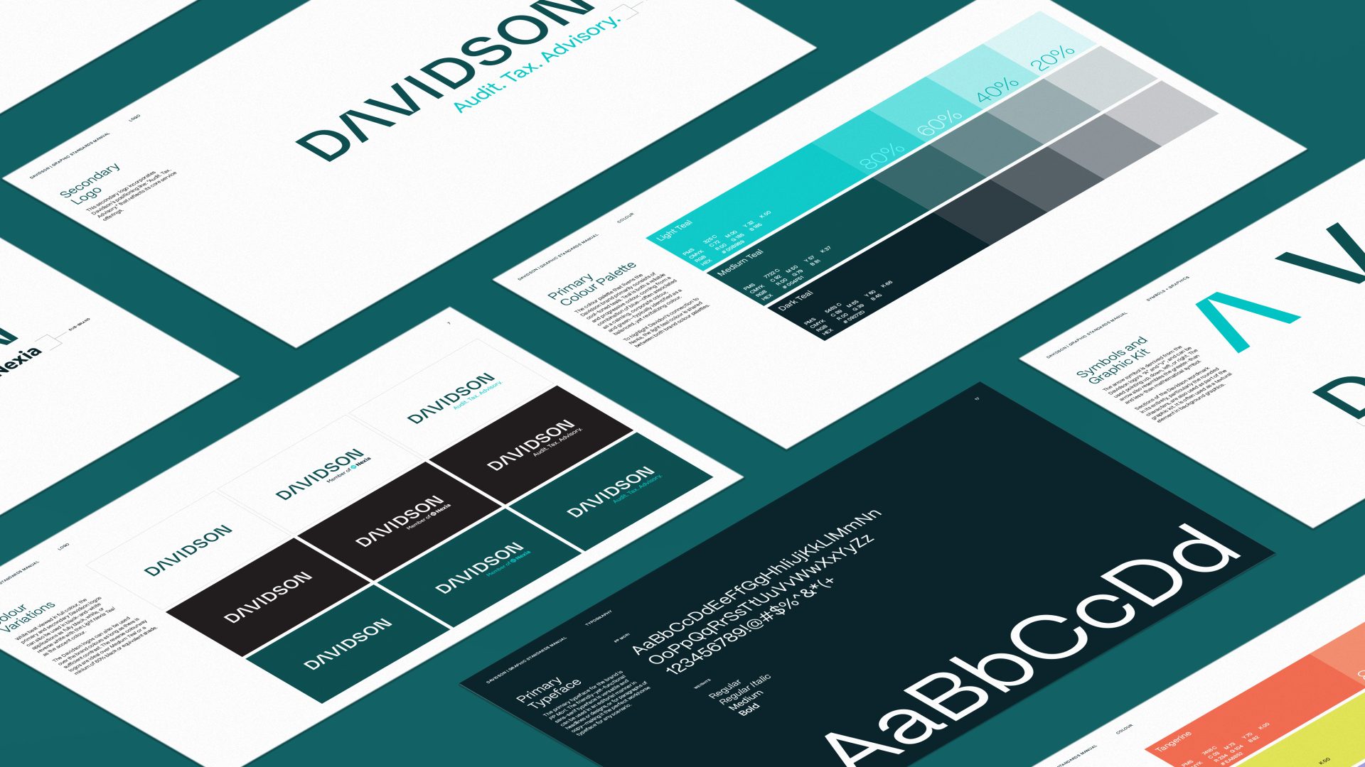
- Visual Identity
- Tone of Voice
- Corporate Templates
- Printed Collateral
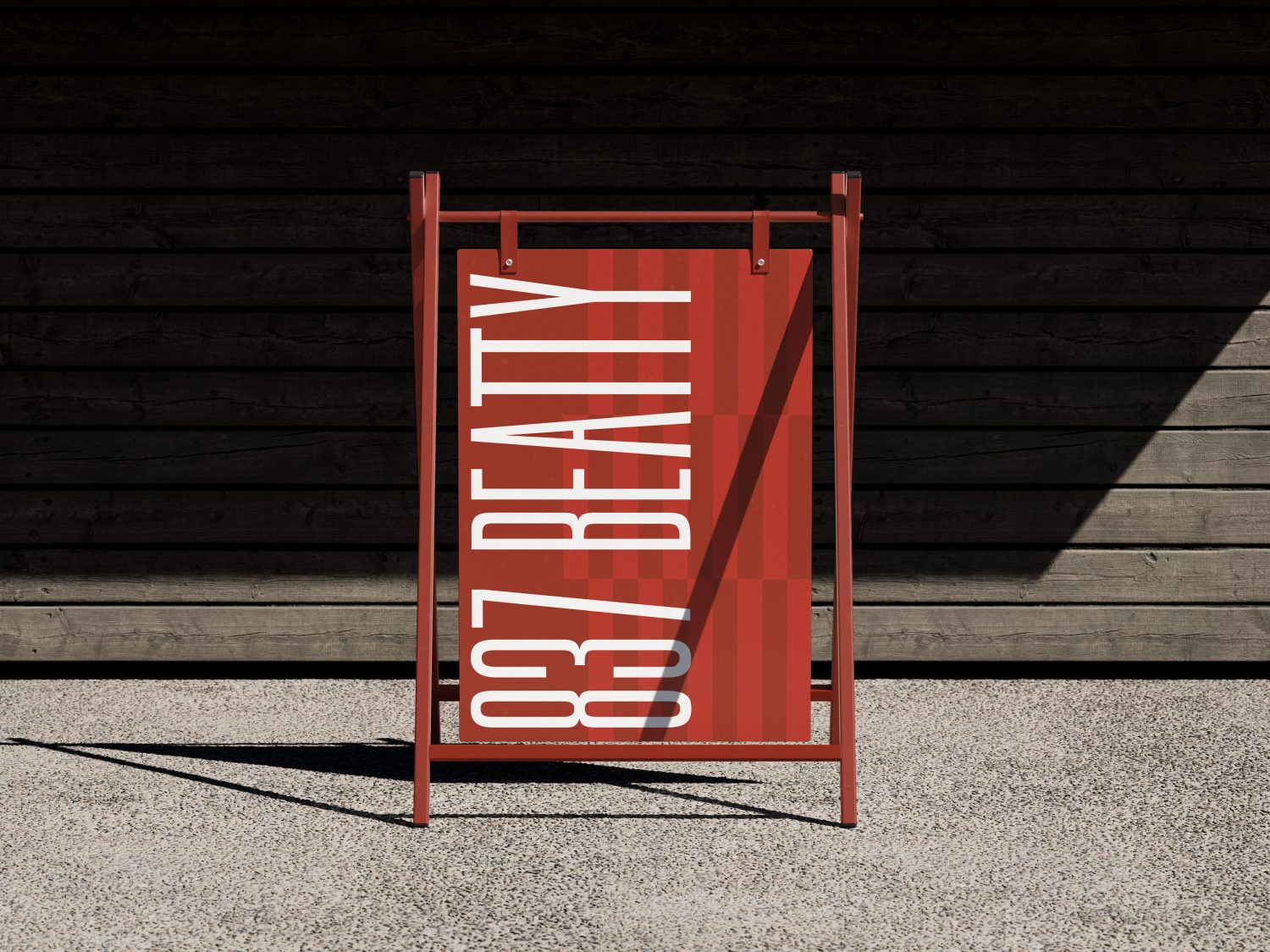
- Environmental Design
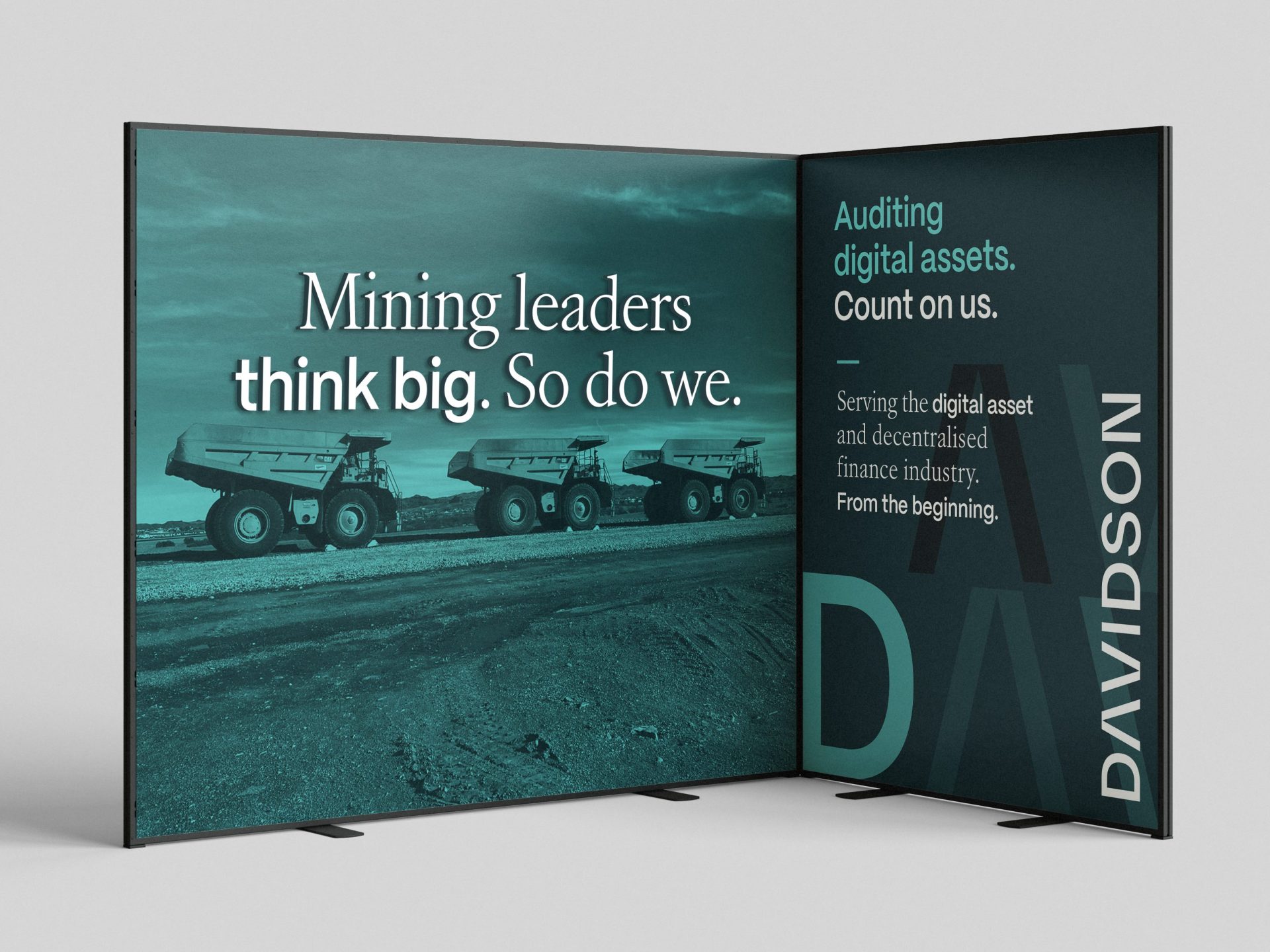
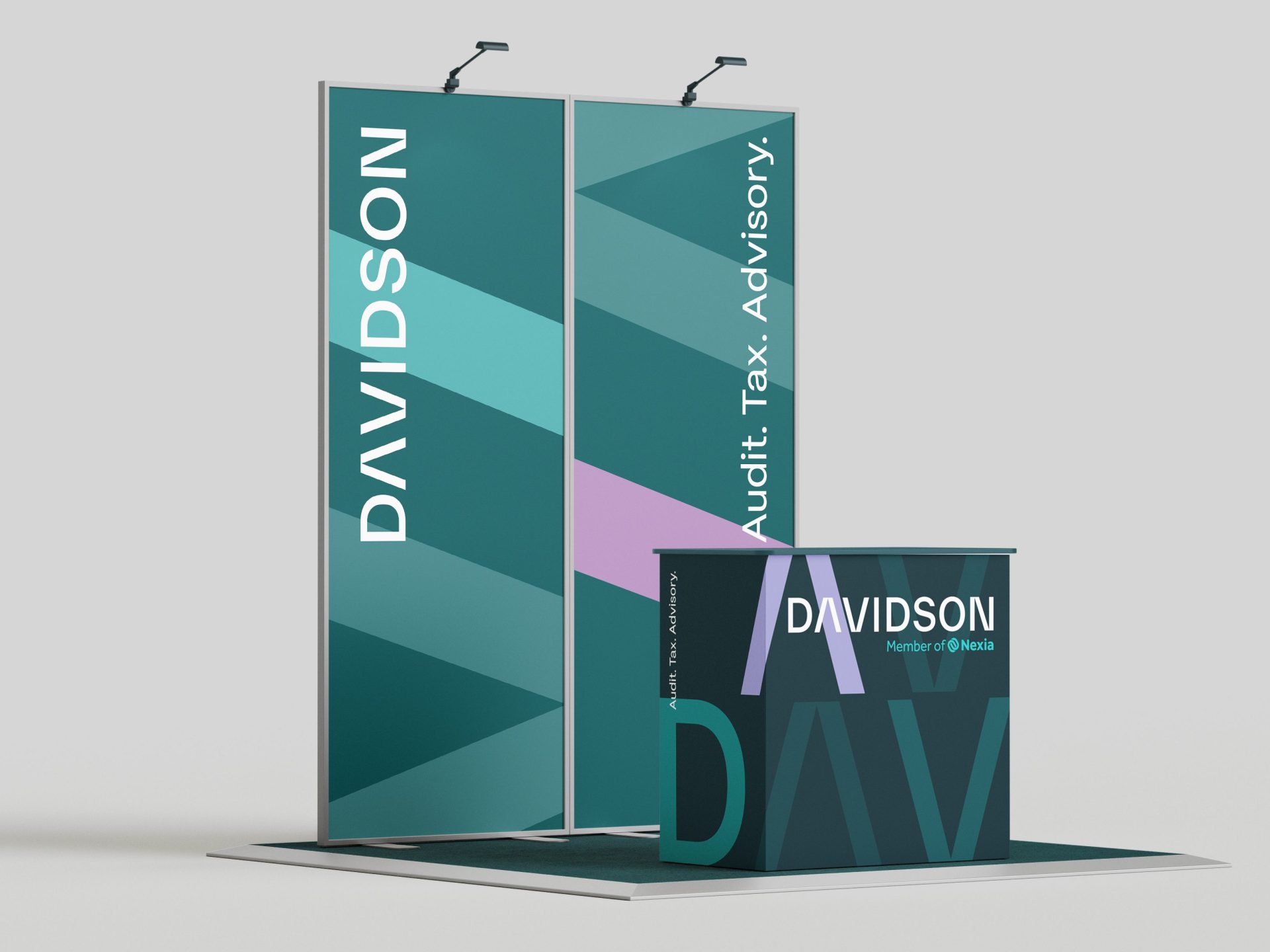
- Tradeshow Materials
- Copywriting
- Advertising
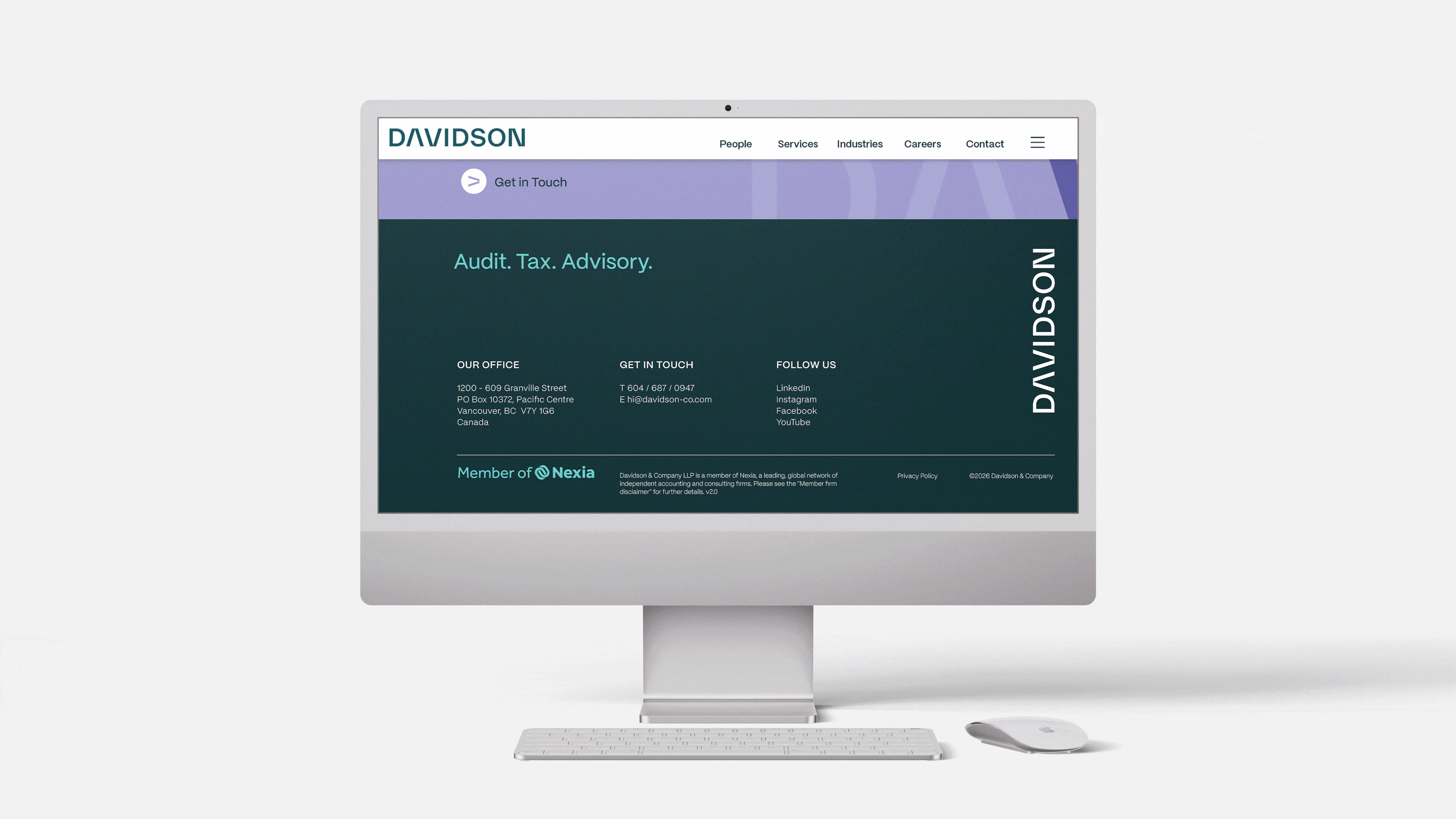
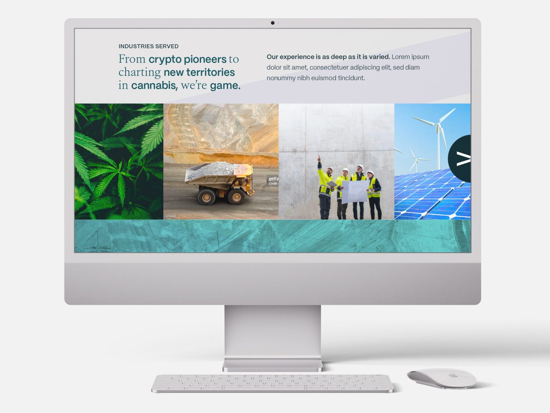
- Website Design
Strategy
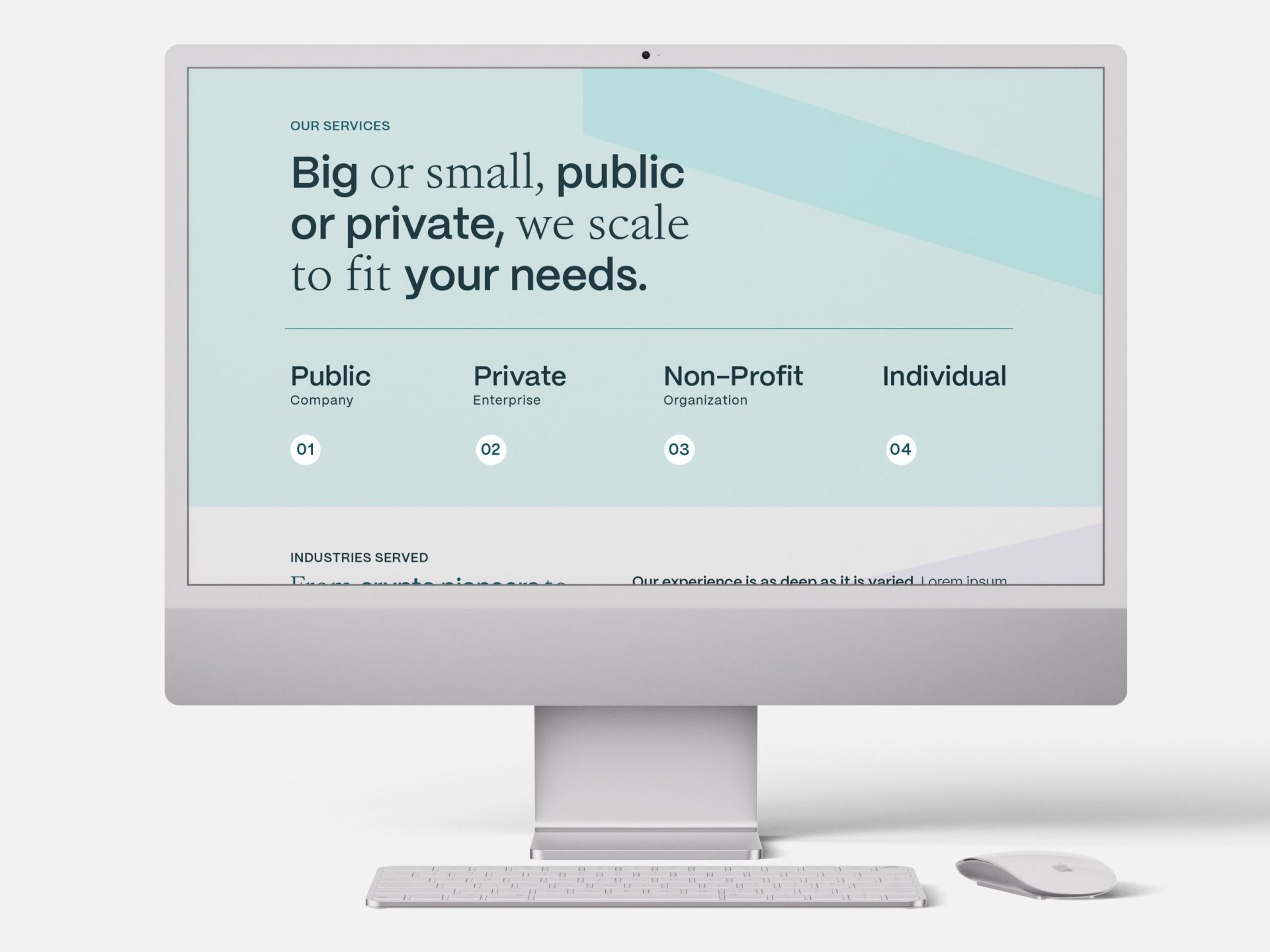
With the momentum of a highly-energetic, engaged brand charette, MIU was equipped with rich insight from which to build a robust rebrand for Davidson. Being unconventionally adventurous and hugely people-focused are standout hallmarks of Davidson, allowing for an atypically vibrant and energetic approach to their brand build. Interacting with the folks at Davidson certainly doesn’t reflect the stereotype of the accounting industry, thereby presenting an open door to a brand that sounds, looks, and feels unexpectedly progressive, fresh, and “unaccounting”.
BRAND IDENTITY
PHOTOGRAPHY


WEB DESIGN
Rationale
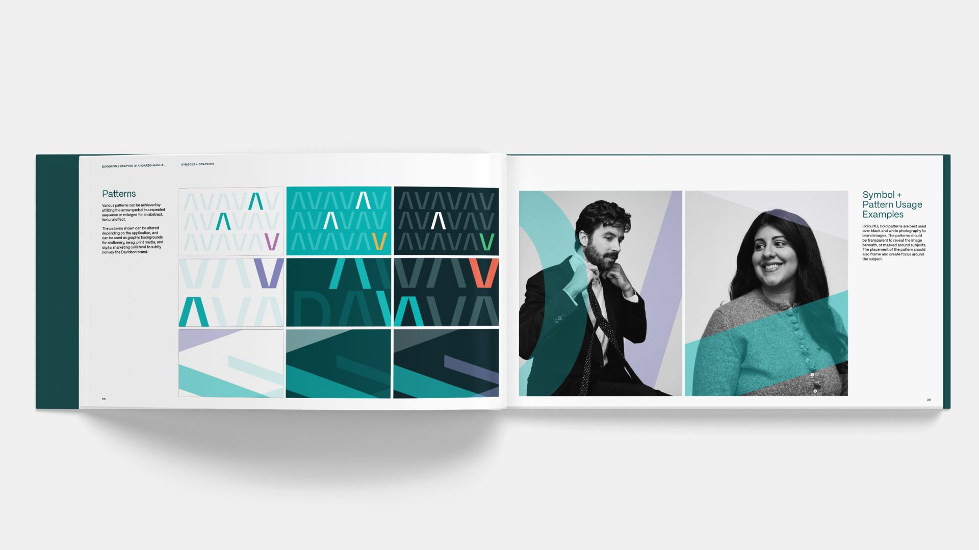
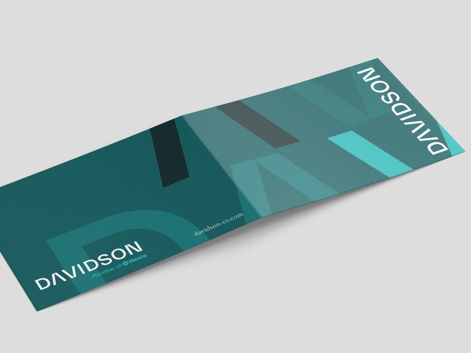
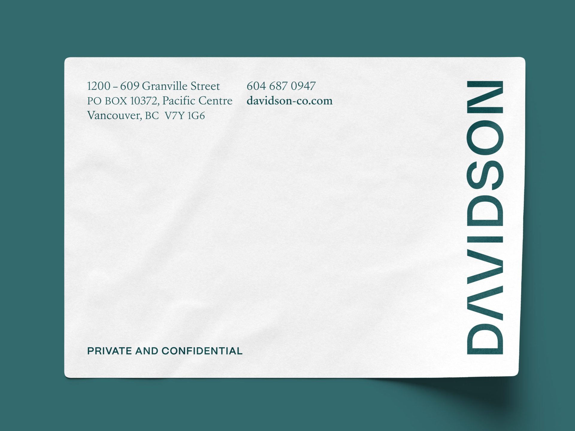
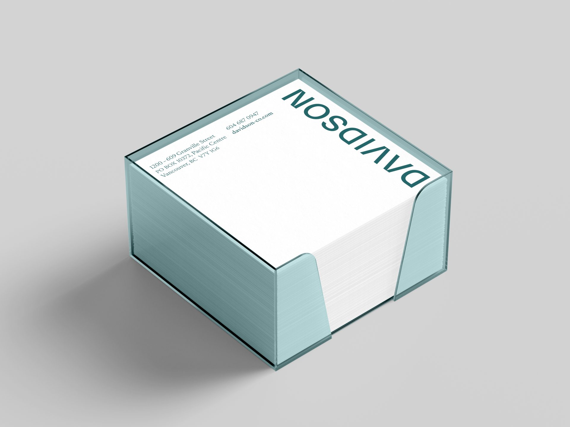
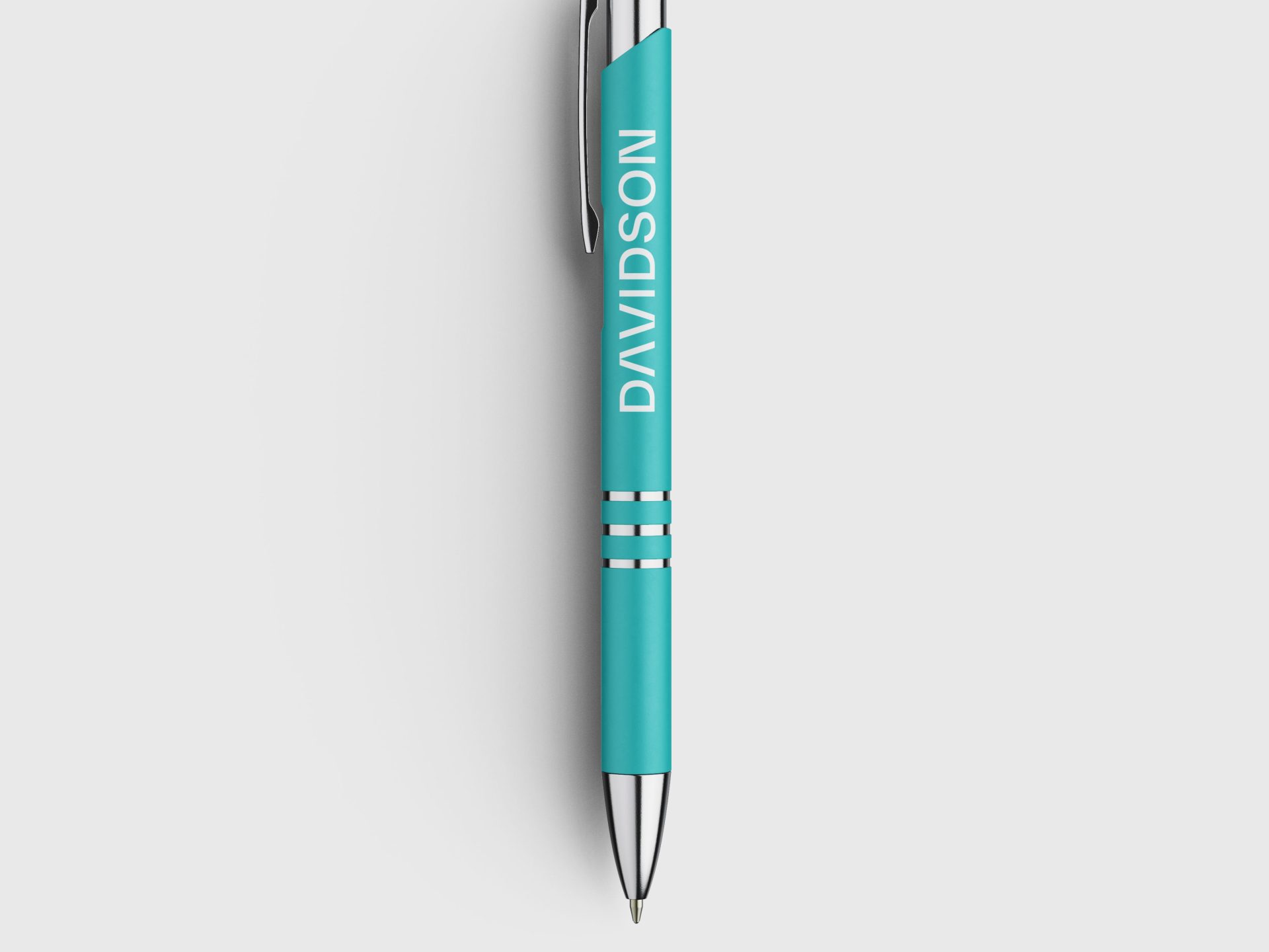
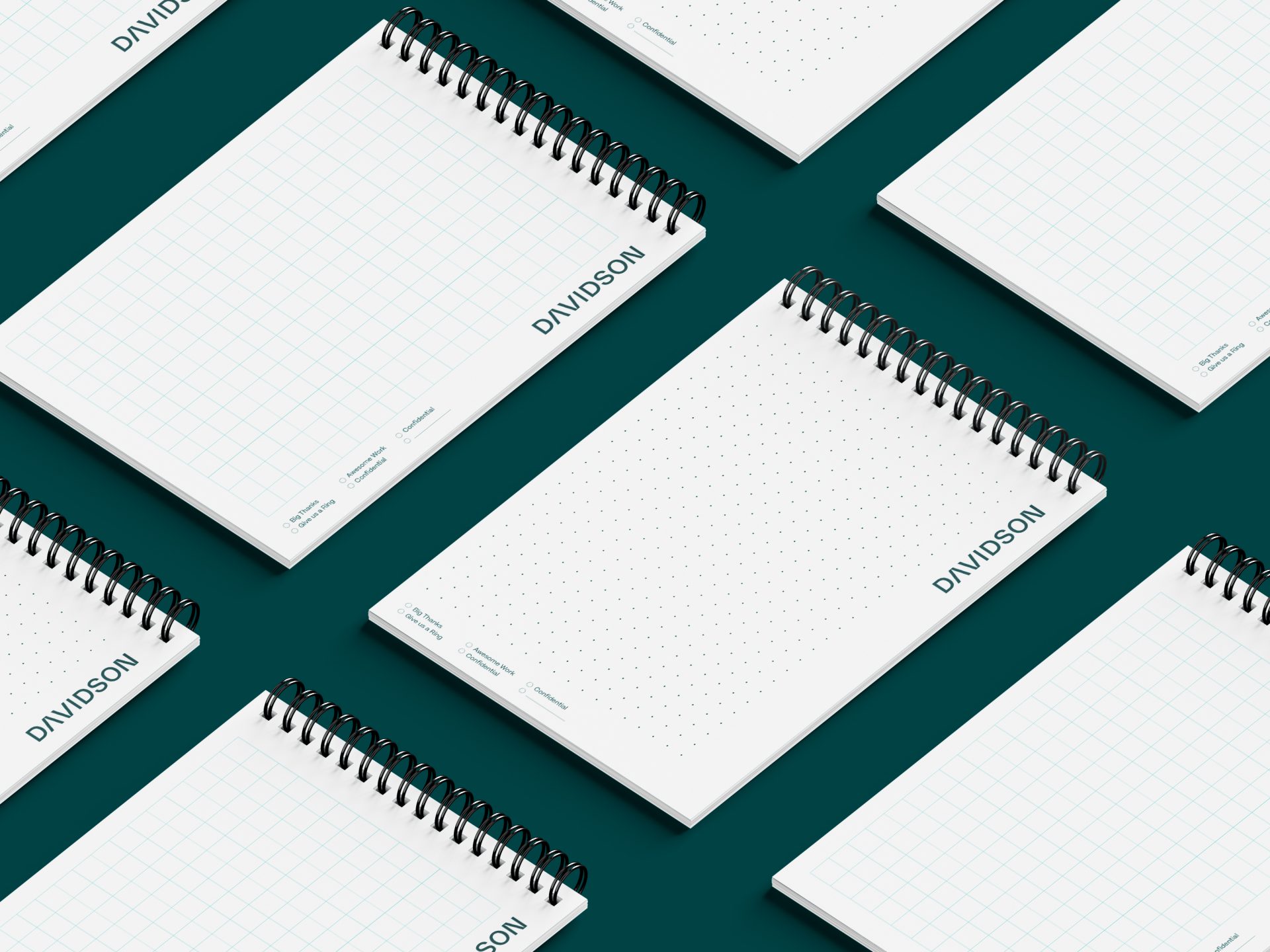
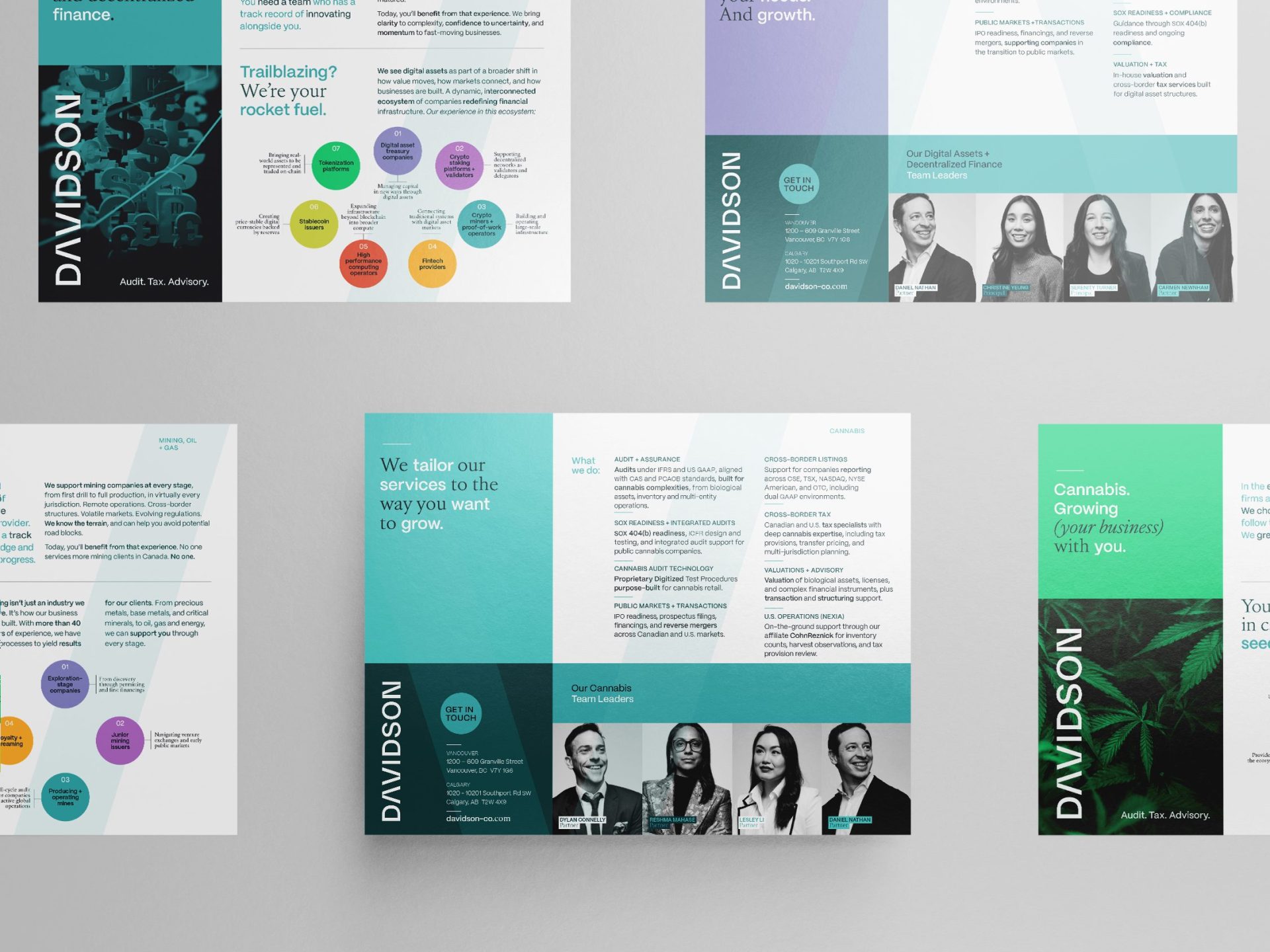
With a strong affiliation to the global Nexia network, a visual bridge was drawn via the integration of their primary teal colour. From there, the design team crafted a vibrant, friendly supporting colour palette that also worked hand-in-hand with the new approachable, modern typography direction, and a bolder logomark was born out of the desire to streamline and modernize. Because of Davidson’s hugely approachable and people-forward culture, MIU leaned into curating a visual language to celebrate the humanity of the brand. Beautiful, high-contrast, black and white candid photographic portraits celebrate the unique personalities and character of each person that make Davidson such a joy to work with.
PRINT DESIGN
TRADE SHOW BOOTH