Forestry Connect
Fostering forestry workforce opportunities for First Nations youth in BC.
Client | FIRST NATIONS FORESTRY COUNCIL
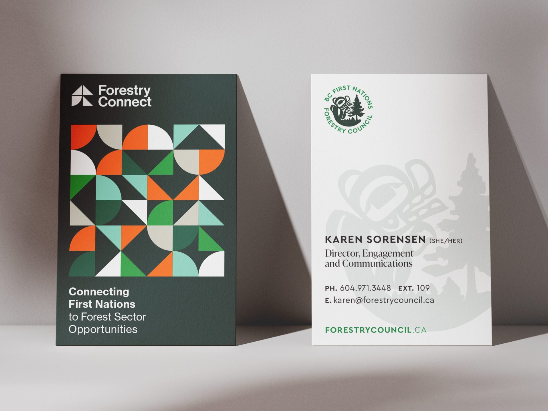
Forestry Connect is a sub-brand for the First Nations Forestry Council under their workforce division. With the purpose of connecting BC First Nations youth to forestry sector employment and academic opportunities, MIU had the task of naming, branding and designing various communications materials.

Services
- Brand Strategy
- Naming
- Visual Identity
- Print Design
- Tradeshow Design
- Website Art Direction
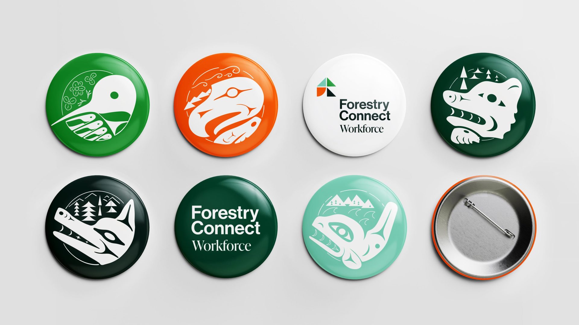
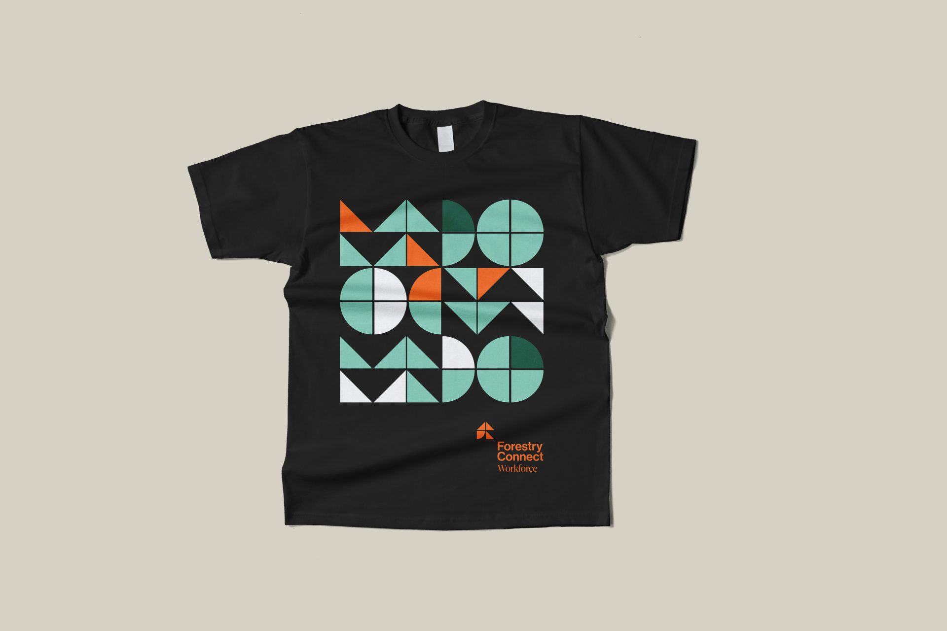
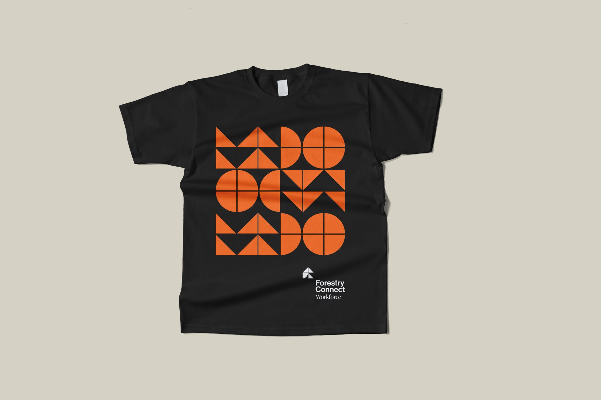
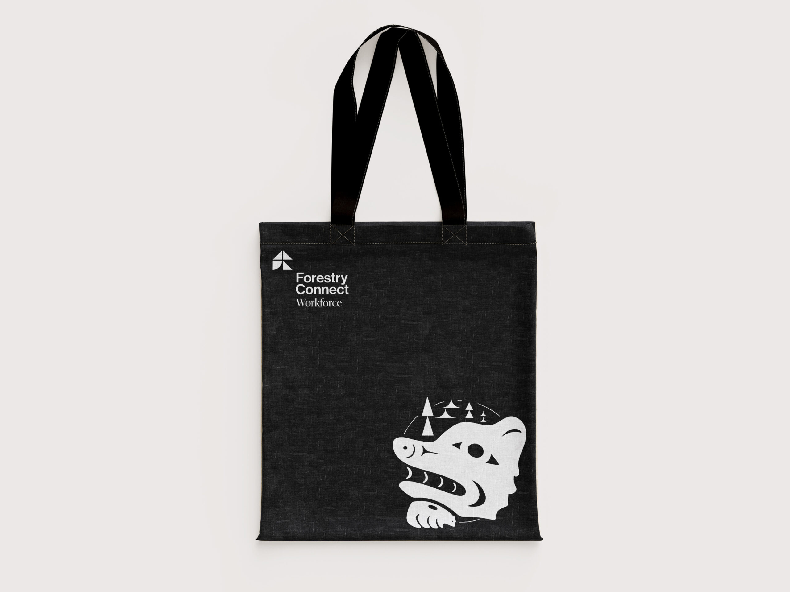
- Event Swag
Strategy
As resonance with First Nations youth was imperative, the strategy was to design an impactful, youthful brand. Working in consultation with the FNFC and its panel of experts, MIU had the honour to learn about and design for a First Nations audience. At the core of this initiative is the concept of connection: interconnectedness between people and the land; connection to Indigenous ways of knowing; and finally as a connector/hub that facilitates interaction between the workforce, educational institutions and employers.
PRINT DESIGN
DIGITAL DESIGN

Rationale
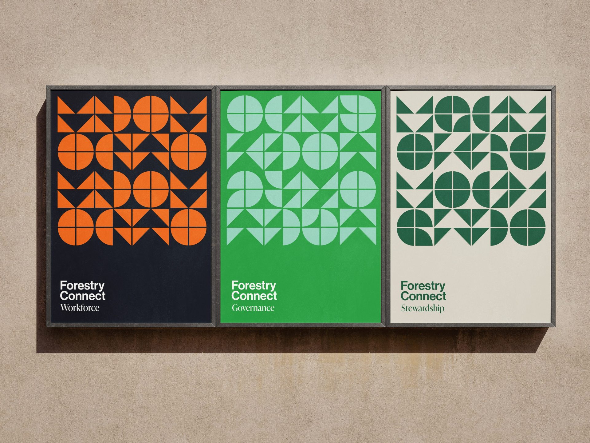
Representing forests, nature and industry resulted in a vibrant colour palette that goes beyond the expected. MIU designed a logo comprised of multiple shapes that together represent a stronger “whole” and also allude to a tree. The brand extension utilized various graphic shapes to create eye-catching patterns and to activate imagery. Careful consideration was given to the possibility that the FNFC could incorporate this branding across their various pillars beyond ‘Workforce’ to also include ‘Stewardship’ and ‘Governance’.
SWAG