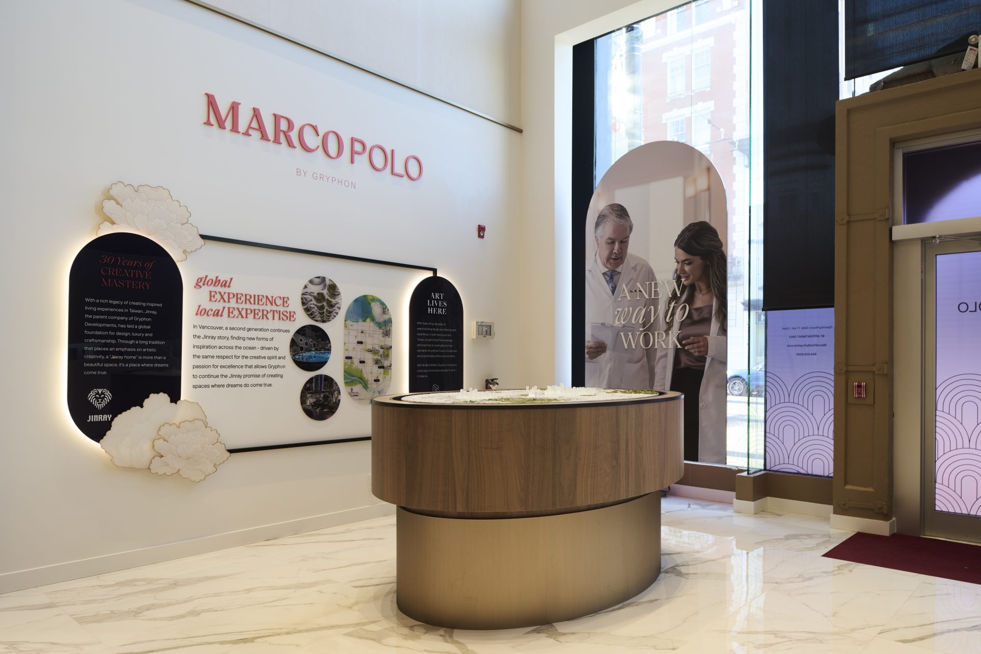
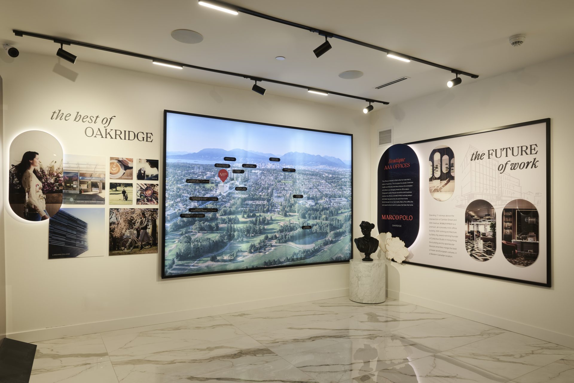
Marco Polo
An asian-inspired philosophy that unifies whole living from the inside out.
Client | GRYPHON DEVELOPMENTS
A local developer with an international perspective brings a 10-storey mixed use residential project to the Oakridge district. With its embrace of cross cultural traditions bridging the east and west, Marco Polo is a holistic offering that brings international sophistication to a health-forward life.

Services
- Brand Strategy
- Naming
- Visual Identity
- Print Design
- Exhibitry Design
- Signage Design
- Digital Design
- Photography Art Direction
- Video Art Direction
- Copywriting
Strategy
Leveraging its international ties, Gryphon seeks to embrace the Asian principles of ‘a life in balance’ in the Marco Polo. With top-notch service and arts-appreciation synonymous with Gryphon, the project strives to elevate living. Wellness-focused commercial programming and exquisite amenity spaces create an environment designed to support a well-lived life.
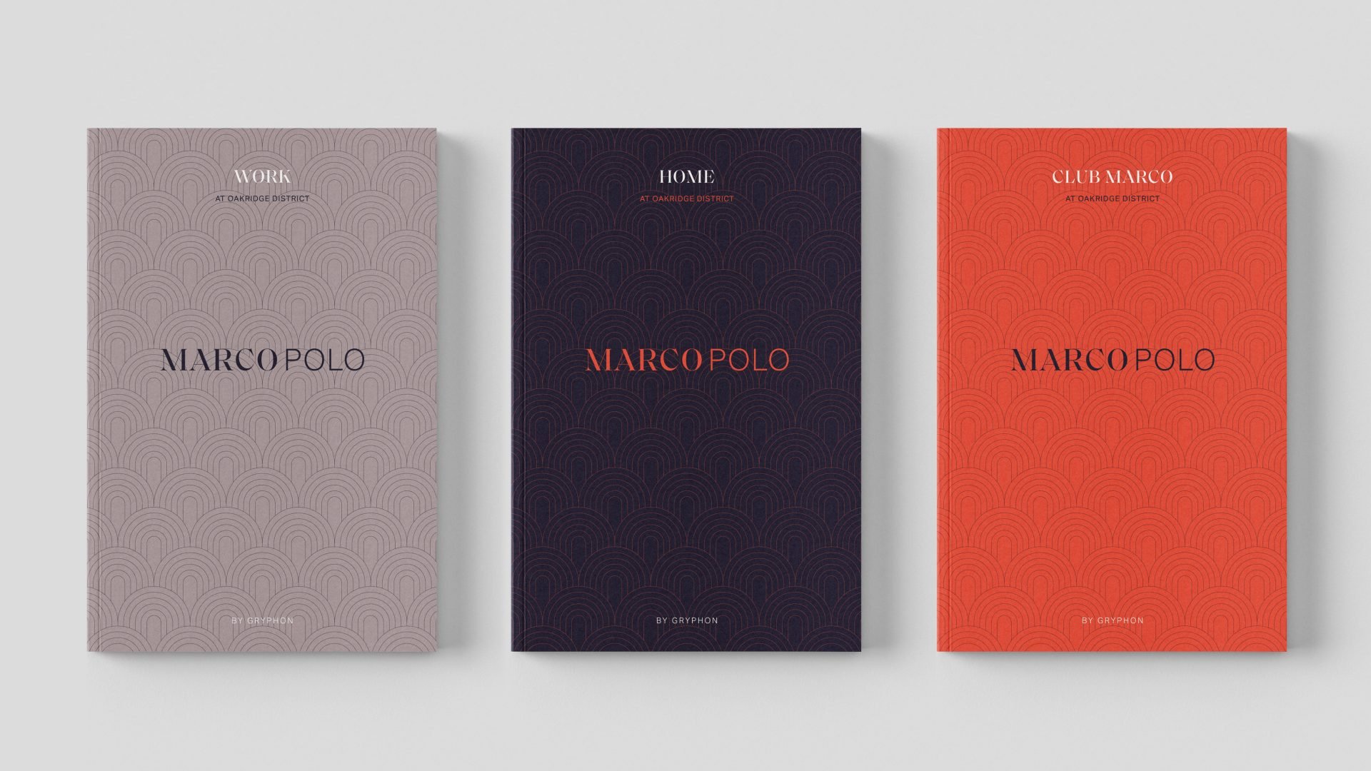
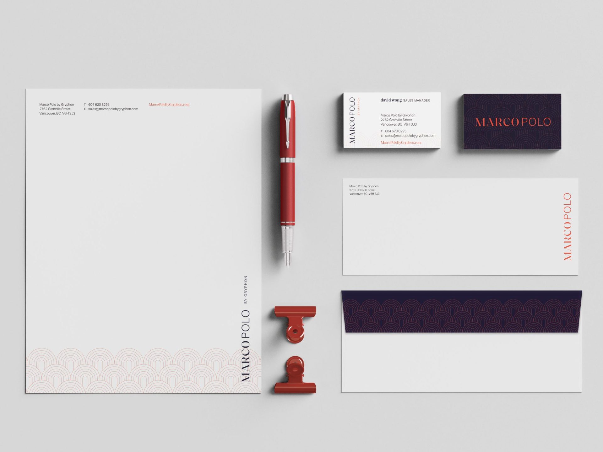
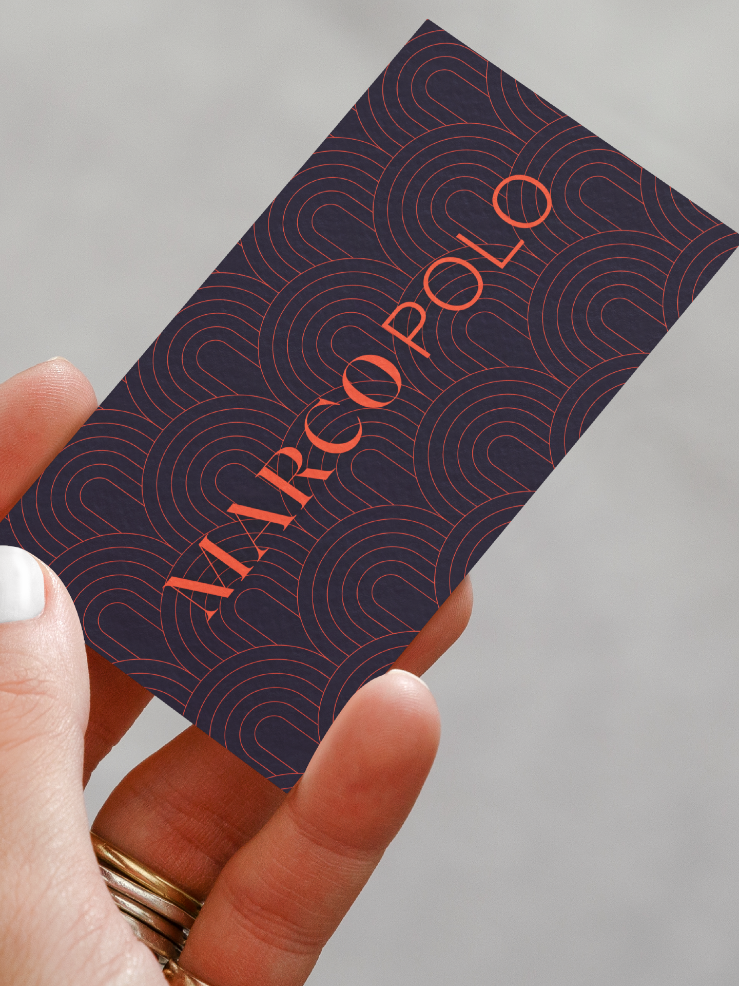
PRINT DESIGN
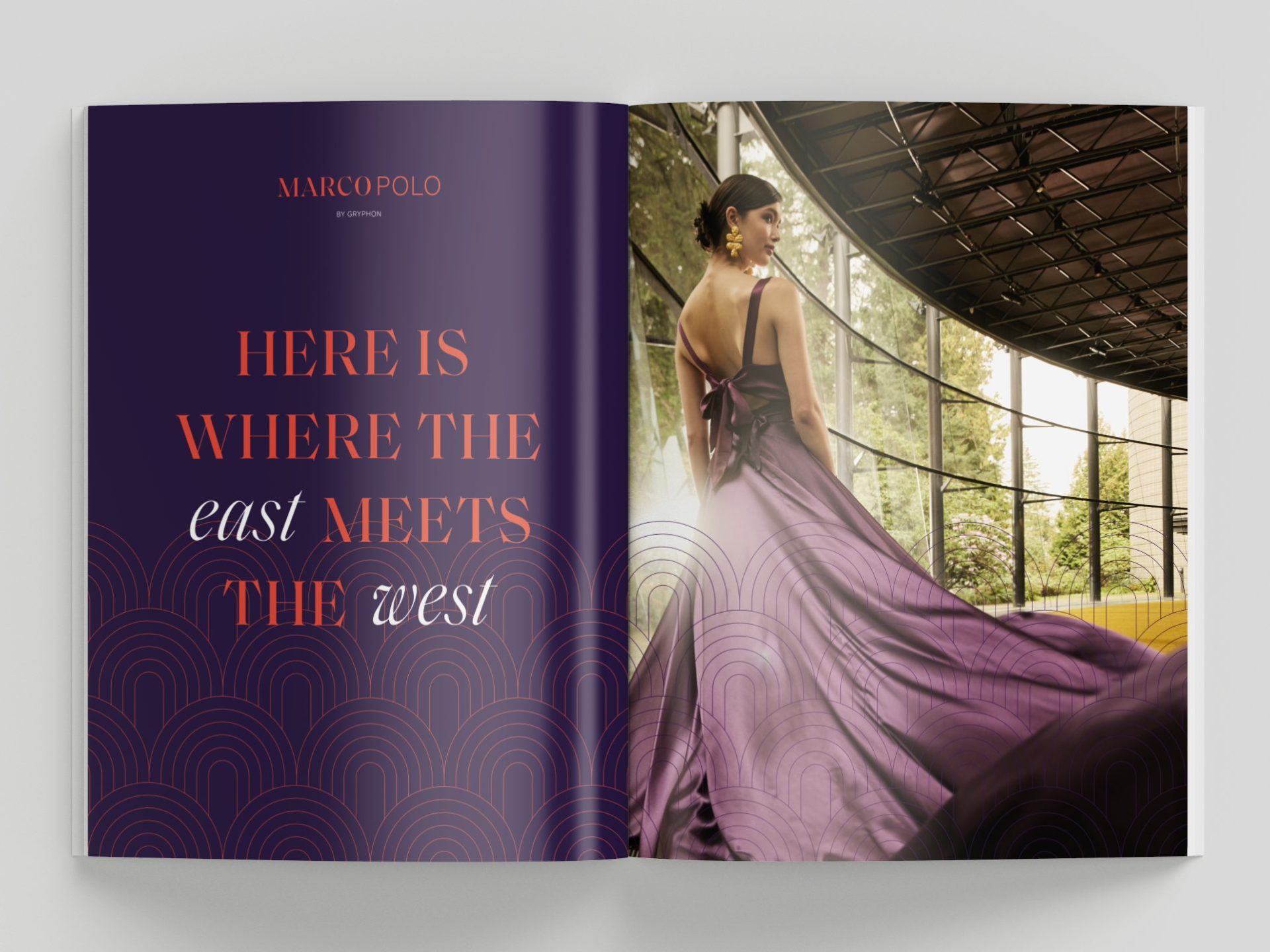
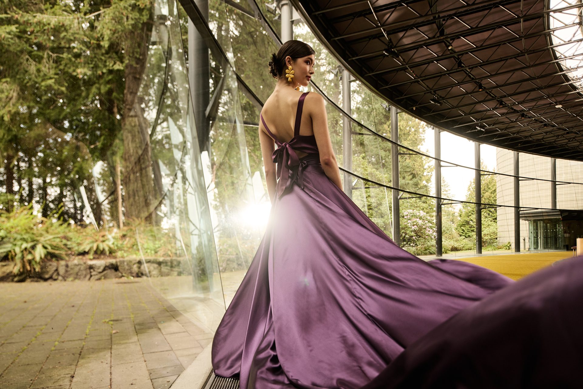
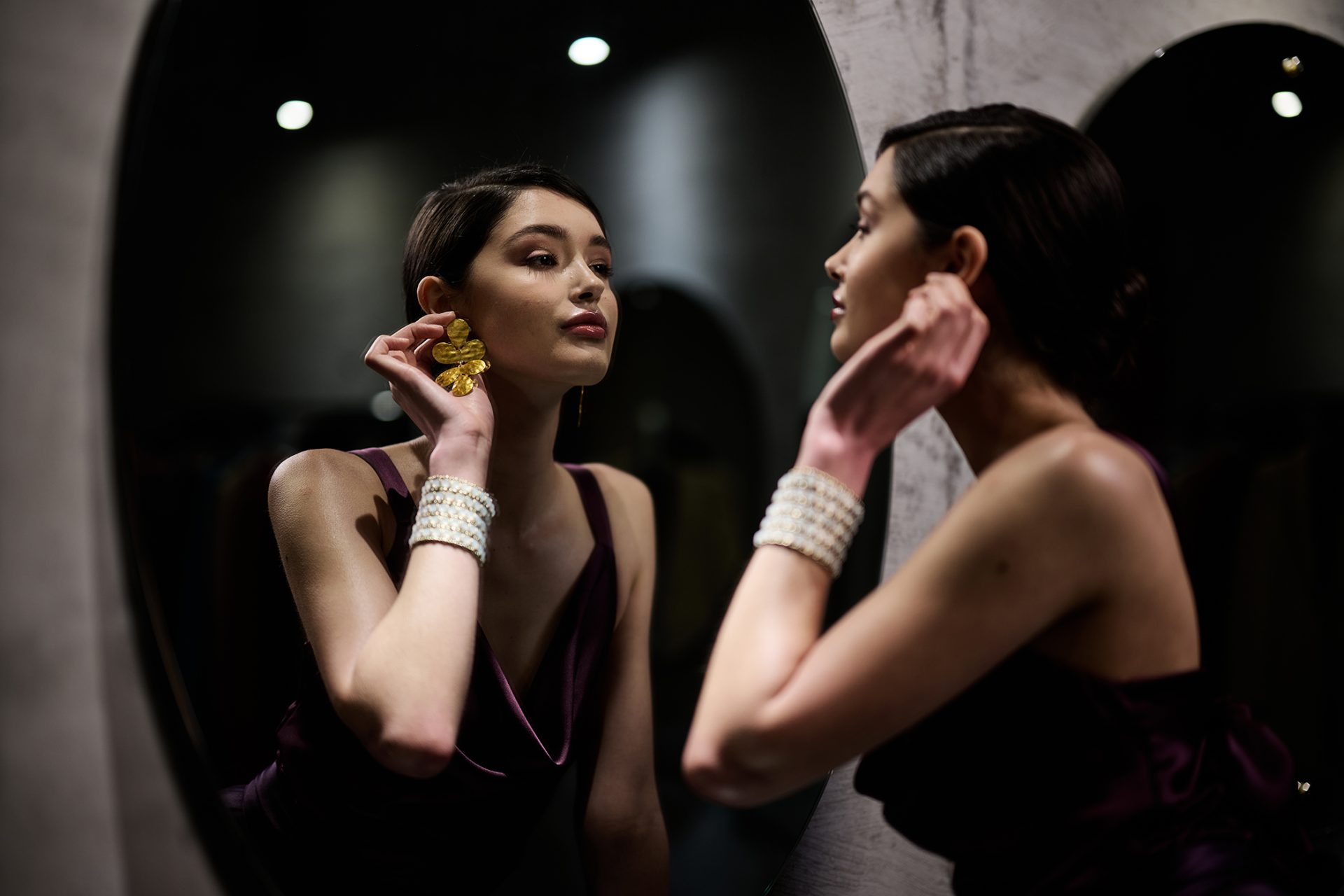
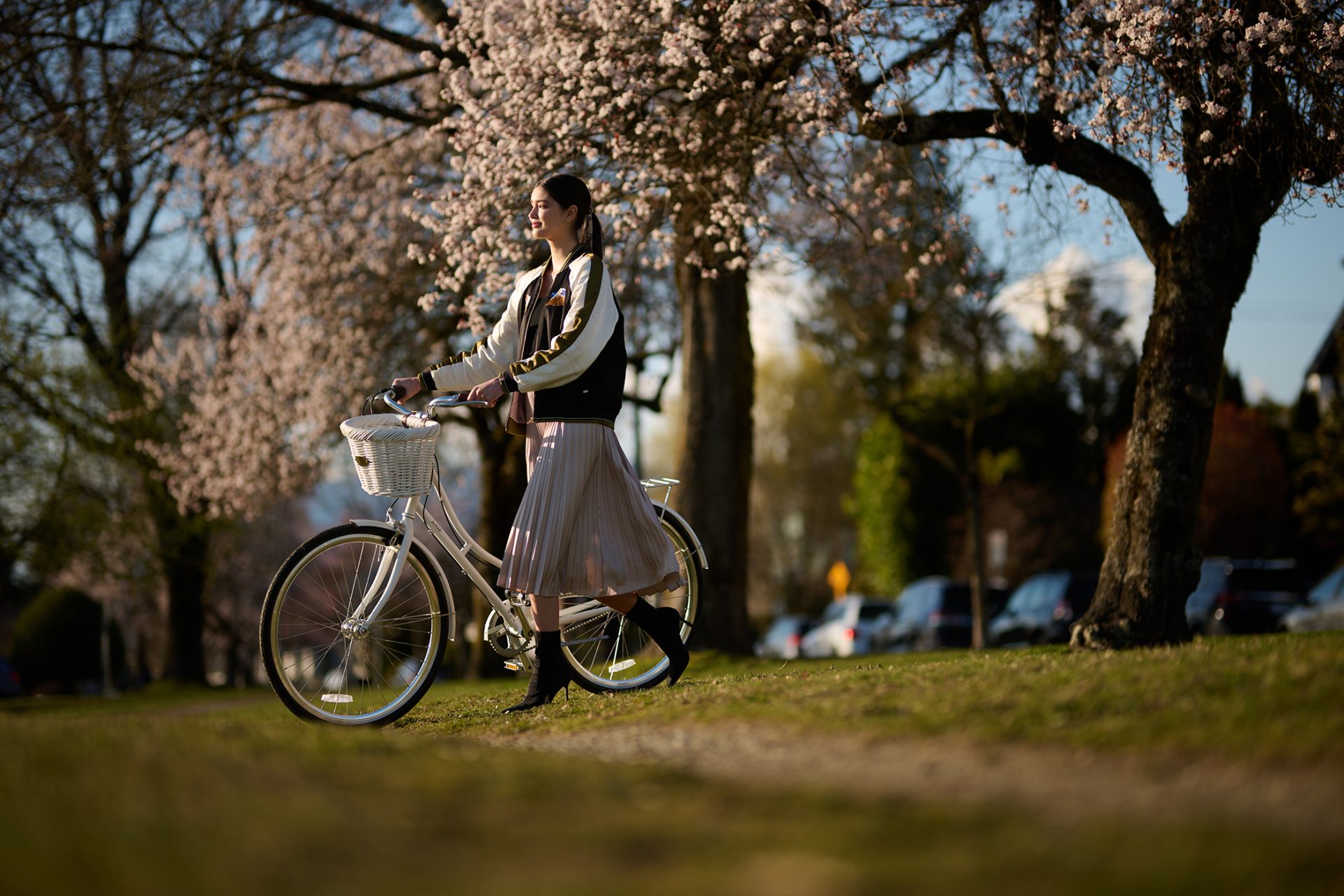
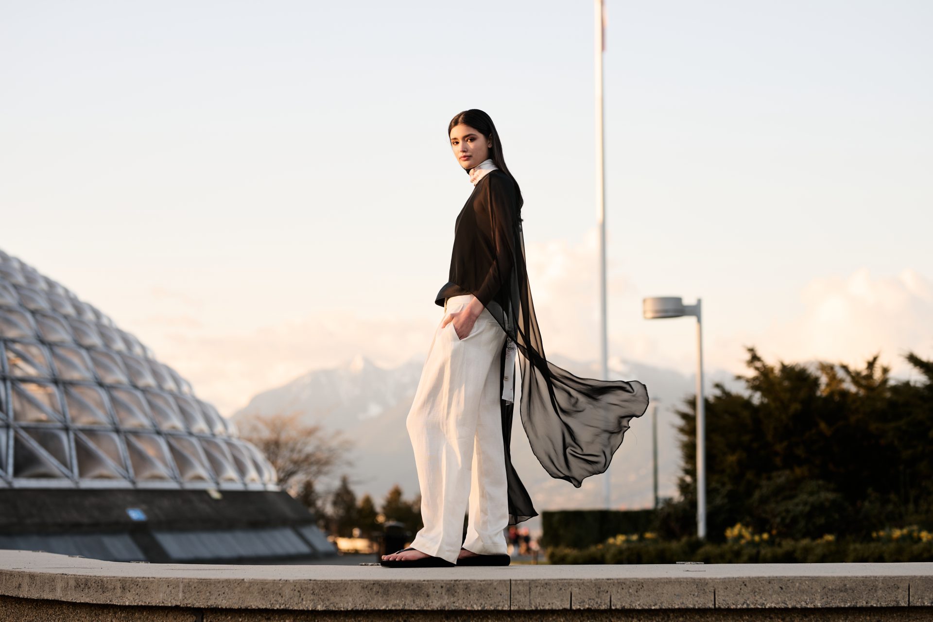
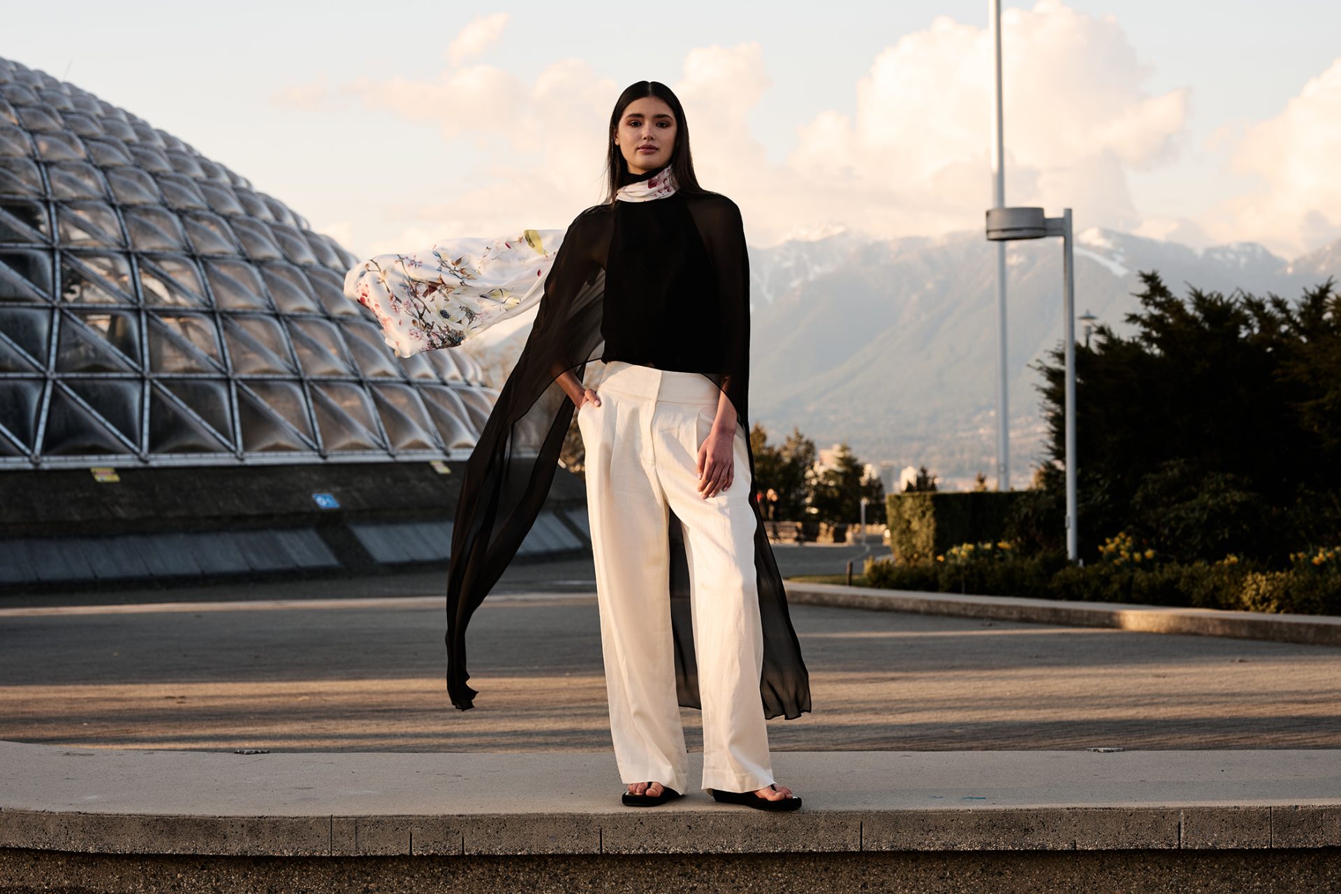
PHOTOGRAPHY


Rationale
With reference to a Shanghai-esque aesthetic results in a brand with rich asian red and aubergine hues. Incorporating vintage asian pattern motifs and a nod to traditional asian silk tapestries, the Marco Polo brand is unapologetically eastern in its look and feel. Photography is decadent – with vibrant and tongue-in-cheek approaches to dining, and melding high fashion to otherwise everyday locations.
ENVIRONMENTAL DESIGN